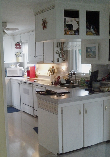
The before image of the kitchen remodel in Stevensville. It was a U shape that had overly crowded counters.
No two kitchens are alike. Okay, well some are but homeowner tastes are not. Everyone wants the main features and styles of their home to reflect them. The kitchen isn’t any different. If anything, at the heart of many homes, it is on the top of the list to be both beautiful and functional. For this kitchen remodel in Stevensville, this was just the case. The homeowner wanted a complete kitchen remodel. Read on to learn more about the difficulties and customer features of this kitchen.
The Challenge & Design
As seen from the before image, this kitchen had limited space. The homeowner wanted a more ‘open space’ feel in the dining room, so the main challenge was adding more storage. Since we were removing the overhead and bottom cabinets, going from a U-shape to an L-shape kitchen, we needed to get creative. The overall goal was to create a cleaner, open appearance, and a brighter updated look. Our Kitchen and Bath Design Center was more than up for the challenge.
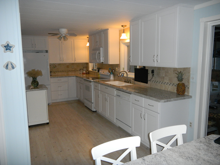
First, we needed to solve for an overall look that would open and give a feeling of a much bigger kitchen. We worked with the homeowners to come up with a design that removed the peninsula and overhead cabinets, making the room seem open and bigger. We also made the flooring consistent throughout the kitchen and dining room, allowing for a cohesive space.
Next, we needed to make up for the storage lost in the peninsula. Our solution? We created a high-top island dining table with cabinets underneath for additional storage. We also got creative with cabinet storage solutions. This included:
- A lazy Susan in the corner cabinet to allow for additional items.
- Tilt-out storage in front of the sink to store sponges and to keep clutter off the sink.
- Customized spice racks added into cabinets allows for better organization and easy access.
- Built-in silverware dividers in the drawers so they fit properly.
- Bottom cabinet with tray dividers for organizing baking sheets

The result of the kitchen remodel in Stevensville was a success.
Finished Kitchen
Mission accomplished! The final product made the homeowners finally feel like this was THEIR kitchen. The details were important. We picked laminate countertops with a granite design to give the clean look they were looking for, as well as stay within the budget of the kitchen remodel. Omega white cabinets were used with Top Knobs hardware. The dining room table gave the additional storage they needed while allowing for an eat-in kitchen feel.
If you are looking into a kitchen remodel, Friel Lumber’s Kitchen and Bath Design Center can help you achieve the kitchen of your dreams. We work with you to create a space that makes sense for your lifestyle and the flow of your home. Contact us today to schedule a consultation.
